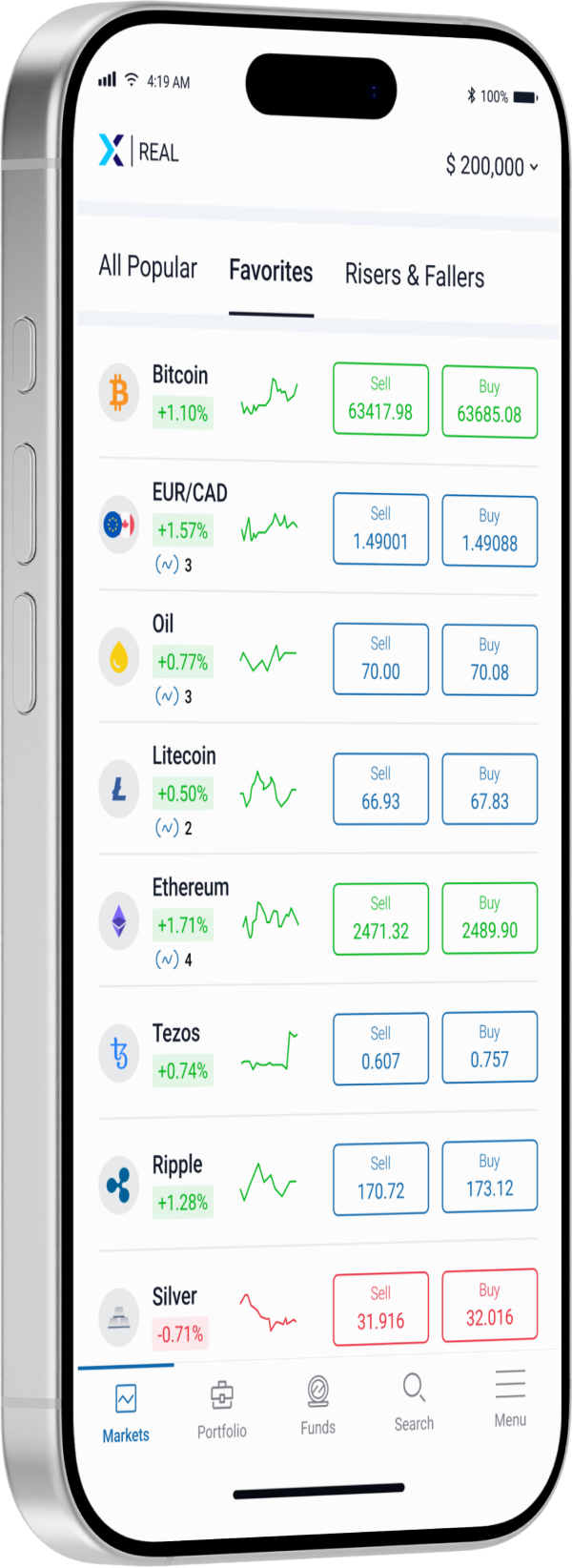
Price charts are among the most widely used tools in financial markets. Regardless of asset class — whether currencies, equities, indices, commodities, or digital assets — charts provide a visual record of how prices have evolved over time. For traders, charts serve as a way to organize market information, observe behavior, and place price movements into context.
Despite their importance, charts are often misunderstood, particularly by those new to trading. They are sometimes treated as predictive devices or as sources of certainty, rather than as descriptive tools that reflect past and present market behavior. This misunderstanding can lead to unrealistic expectations and overreliance on visual patterns without sufficient context.
This article explores the fundamentals of chart reading with a focus on trends and price action. Rather than presenting charts as a way to forecast outcomes, it explains how they can be used to interpret market structure, understand participation, and support disciplined decision-making across different market conditions.
What a Price Chart Actually Shows
At its most basic level, a price chart plots the movement of an asset’s price over time. Each movement reflects the interaction between buyers and sellers, incorporating available information, expectations, and sentiment at that moment. Every price point is the result of countless decisions made by market participants with different objectives, time horizons, and risk tolerances.
Charts do not explain why price moved; they show that it moved. This distinction is important. The causes of price movement — such as economic data, earnings reports, geopolitical events, or shifts in sentiment — exist outside the chart. The chart simply records the outcome of these forces as expressed through price.
Understanding charts as historical and real-time records, rather than predictive maps, helps traders use them more effectively.
Example of a basic price chart showing price movement over time
Common Chart Types and What They Emphasize
Different chart types present price data in different ways, each highlighting certain aspects of market behavior.
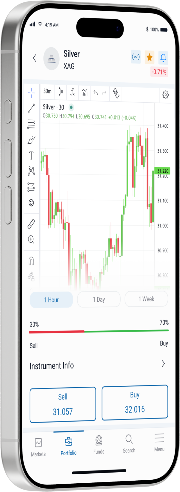
A line chart connects closing prices over a selected timeframe, offering a simplified view of overall direction. It is useful for observing long-term trends or broad market movement but provides limited detail about intraperiod activity.
Bar charts and candlestick charts provide more granular information. They show the opening, highest, lowest, and closing prices within each time interval. This additional detail helps traders observe volatility, momentum, and the balance between buying and selling pressure during specific periods.
Candlestick charts, in particular, are widely used because they visually represent price behavior in a compact and intuitive way. However, the effectiveness of any chart type depends less on the format itself and more on how the information is interpreted.
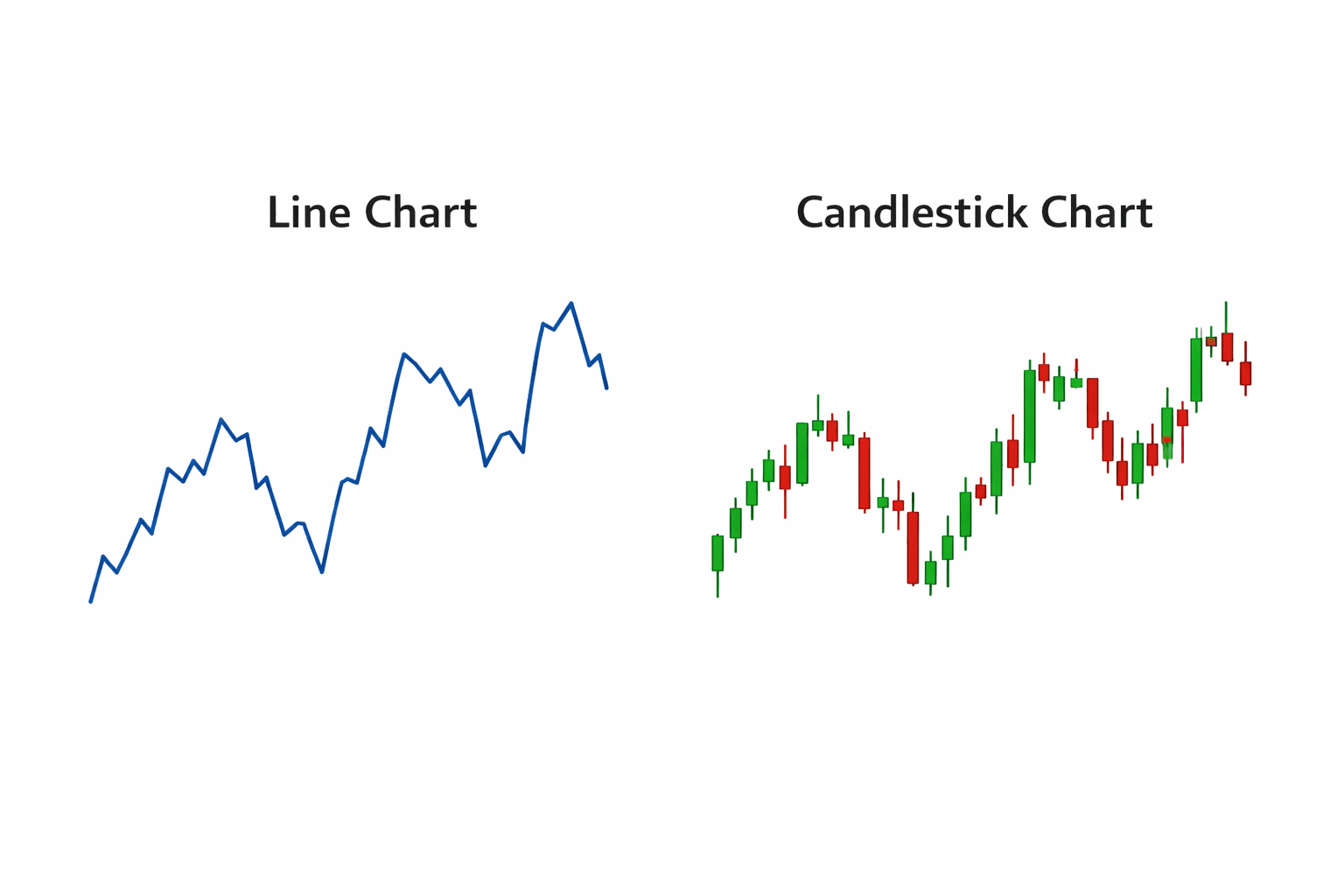
Comparison of line chart vs candlestick chart for the same market
Timeframes and Context in Chart Analysis
One of the most important yet often overlooked aspects of charting is timeframe selection. Markets behave differently depending on the time horizon being observed. A chart showing minute-by-minute price movement may appear highly volatile, while a chart showing weekly data may reveal a relatively stable trend.
Shorter timeframes tend to emphasize noise and immediate reactions, while longer timeframes highlight structural movement and broader market direction. Neither perspective is inherently superior; each serves a different analytical purpose.
Many traders observe multiple timeframes to build context. For example, a longer timeframe may be used to identify the prevailing market direction, while a shorter timeframe helps observe how price behaves within that broader structure. This layered approach helps prevent misinterpretation of isolated movements.
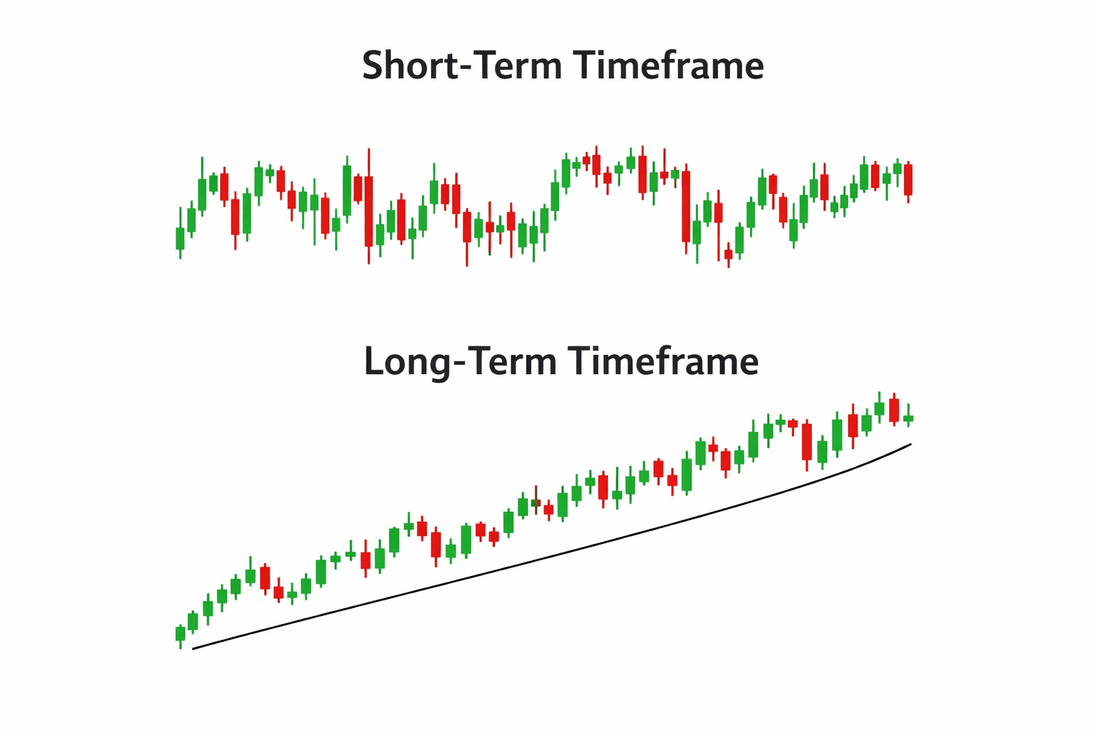
Same asset shown on short-term and long-term timeframes
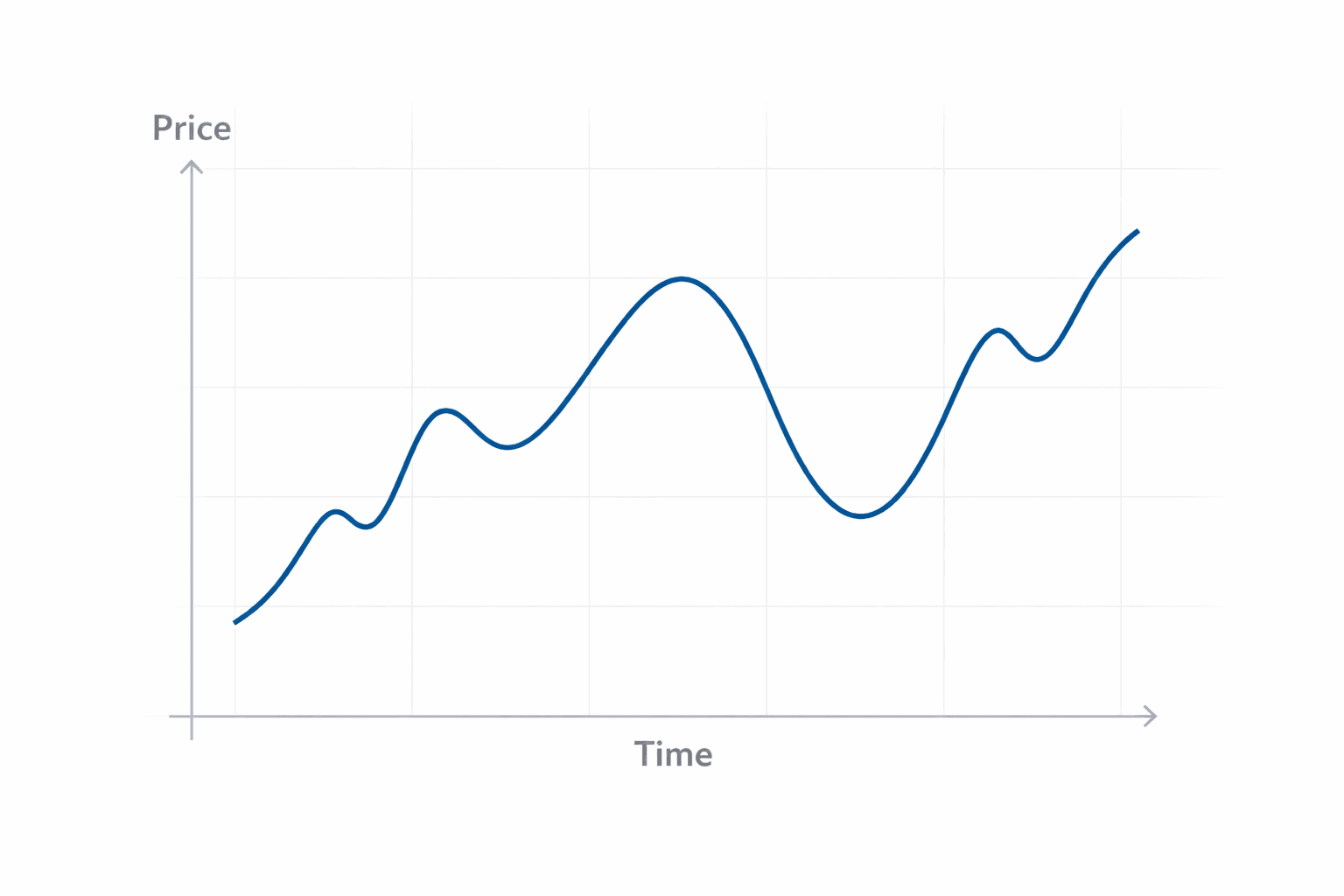
Understanding Trends as Market Behavior
A trend describes the general direction in which price moves over a sustained period. Trends form when there is a persistent imbalance between buying and selling interest. When buyers consistently accept higher prices, an upward trend may develop. When sellers consistently accept lower prices, a downward trend may emerge.
Trends are not straight lines. They unfold through advances, pullbacks, pauses, and periods of consolidation. Recognizing this helps traders avoid expecting uninterrupted movement in one direction.
Equally important is recognizing when a market is not trending. Ranging or sideways markets reflect a relative balance between buyers and sellers, where price oscillates within a defined area. Understanding whether a market is trending or ranging provides context for interpreting price action and managing expectations.
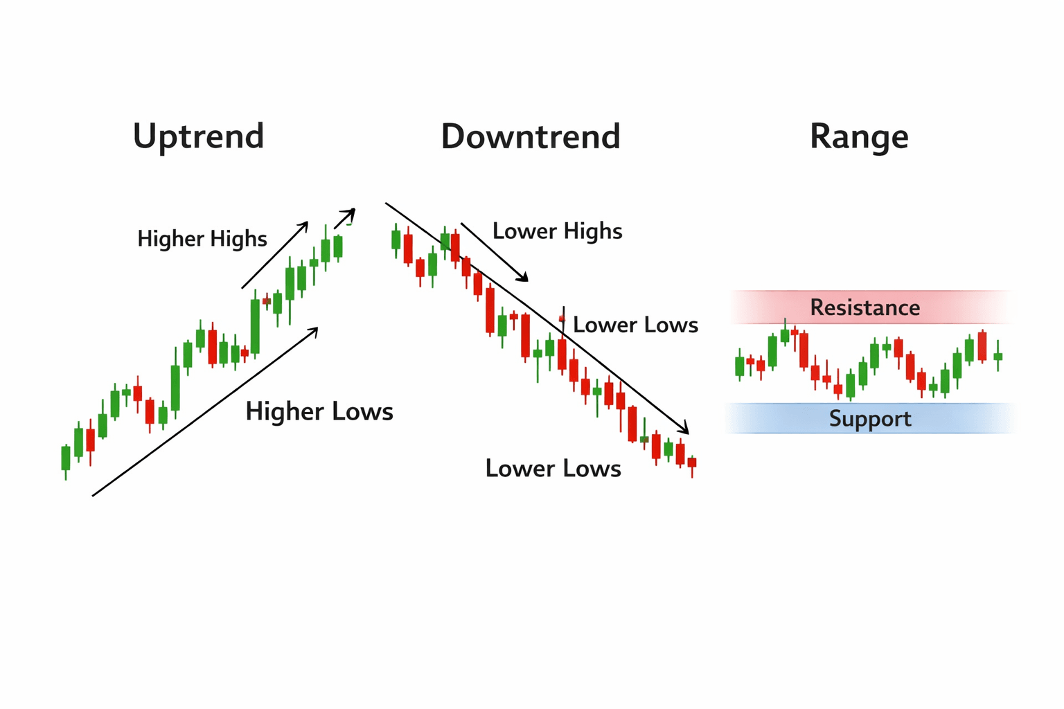
Example of an upward trend, downward trend, and range-bound market
Market Structure: Highs, Lows, and Progression
Beyond direction, charts reveal market structure — the sequence of highs and lows that form over time. In trending markets, price tends to create higher highs and higher lows in upward movement, or lower highs and lower lows in downward movement.
This progression reflects how market participants adjust expectations. Observing changes in structure can help traders recognize shifts in momentum or transitions between trending and ranging conditions.
Market structure is not about predicting reversals, but about recognizing how behavior is evolving. Subtle changes in the formation of highs and lows often occur before broader directional changes become apparent.
Support and Resistance as Areas of Interest
Support and resistance are concepts used to describe areas where price has historically encountered increased buying or selling interest. These areas form as markets repeatedly respond to certain price levels, reflecting collective behavior rather than fixed rules.
Support refers to zones where downward movement has tended to slow or pause, while resistance refers to zones where upward movement has faced pressure. These areas are not exact points; they are ranges influenced by timeframe, market conditions, and participation.
Support and resistance help traders contextualize where price is relative to past behavior. They do not guarantee reactions, but they highlight areas where attention from market participants has previously increased.
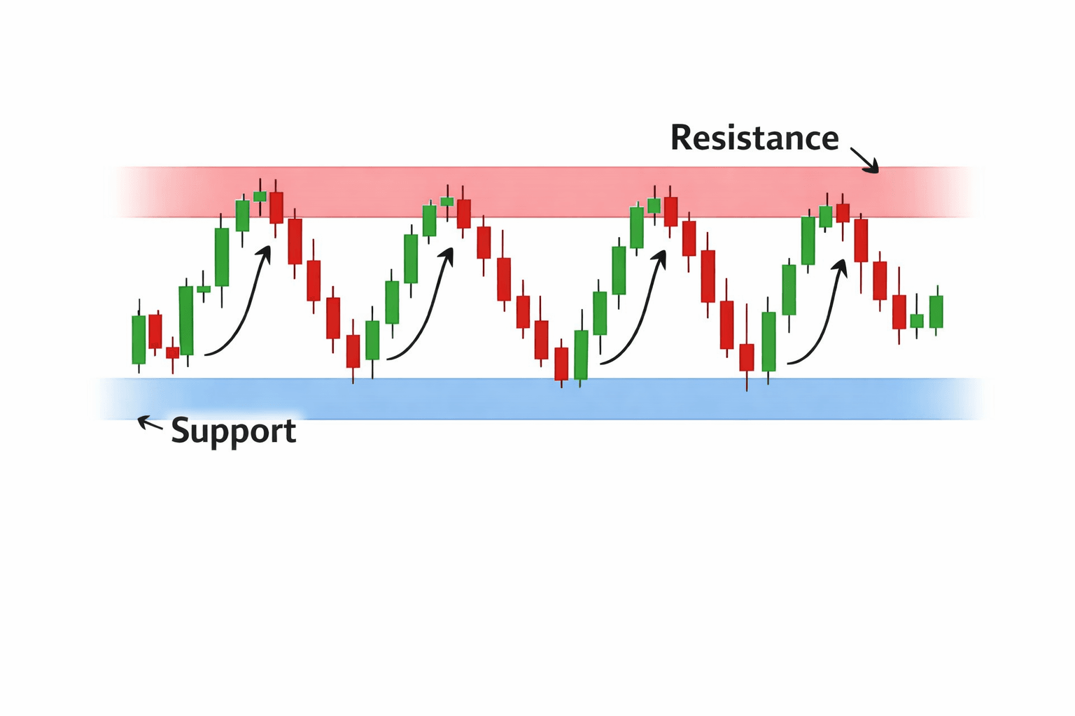
Chart annotated with support and resistance zones
Price Action as a Reflection of Participation
Price action refers to the raw movement of price as it unfolds on the chart. It reflects how participants respond to information in real time. Sharp moves may indicate urgency or imbalance, while gradual movement may reflect steady participation. Periods of consolidation often suggest uncertainty or equilibrium.
Observing price action involves watching how price behaves near key levels, how momentum changes, and how volatility expands or contracts. Rather than offering signals, price action provides context about market conditions.
This observational approach encourages patience and interpretation, rather than immediate reaction.
Volatility and Its Visual Expression on Charts
Volatility describes the degree of price fluctuation within a given period. On charts, volatility appears as the size and frequency of price movements. Periods of high volatility often feature larger price ranges and faster movement, while low-volatility periods show smaller, more compressed movement.
Understanding volatility helps traders adjust expectations and risk considerations. A market that has recently exhibited wide price swings may behave differently from one that has been relatively stable.
Charts allow volatility to be observed visually, supporting more informed assessments of current conditions.
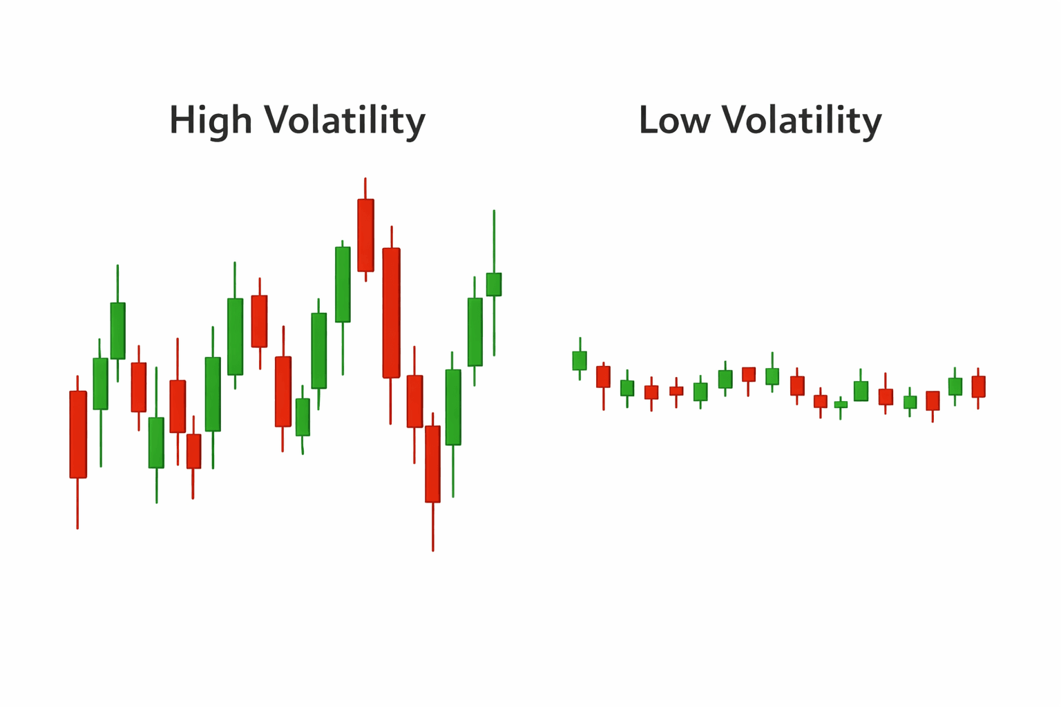
Comparison of high-volatility vs low-volatility price action
Indicators as Supporting Tools, Not Substitutes
Technical indicators are mathematical tools derived from price data. They may highlight trends, momentum, or volatility, but they do not provide independent information. Indicators interpret price; they do not replace it.
When used thoughtfully, indicators can complement chart reading by offering additional perspective. When used without context, they may obscure the underlying price behavior. Understanding what an indicator measures — and what it does not — is essential.
Charts remain the primary source of market information. Indicators are secondary tools that support interpretation.
Charts and Risk Awareness
Charts are also central to understanding and managing risk. They help traders visualize how price has behaved under different conditions, where volatility has expanded, and how markets have reacted near certain levels.
This information supports decisions related to position size, exposure, and protective measures. Charts do not define risk, but they provide context that helps traders assess it more realistically.
Price charts are visual representations of collective market behavior. They do not offer certainty, predictions, or guarantees. What they provide is structure — a way to observe how prices have moved, how markets have responded to information, and how conditions have evolved over time.
By learning to read trends, understand market structure, and interpret price action within context, traders develop a more grounded perspective on market behavior. Charts support informed observation rather than prediction and encourage discipline rather than reaction.
Used thoughtfully and in combination with broader market understanding, charting becomes a valuable tool for navigating the markets with clarity and perspective.
Trading CFDs involves significant risk and may not be suitable for all investors.